 View on GitHub
 Final Design Reference
Final Design Specification
During the project many changes were made from the client design to the final one, the rationale for which is provided in Design Process. A descriptive overview of the final design is provided here, with images of final design, all four domains and the graph pictured directly below for context.
Architecture
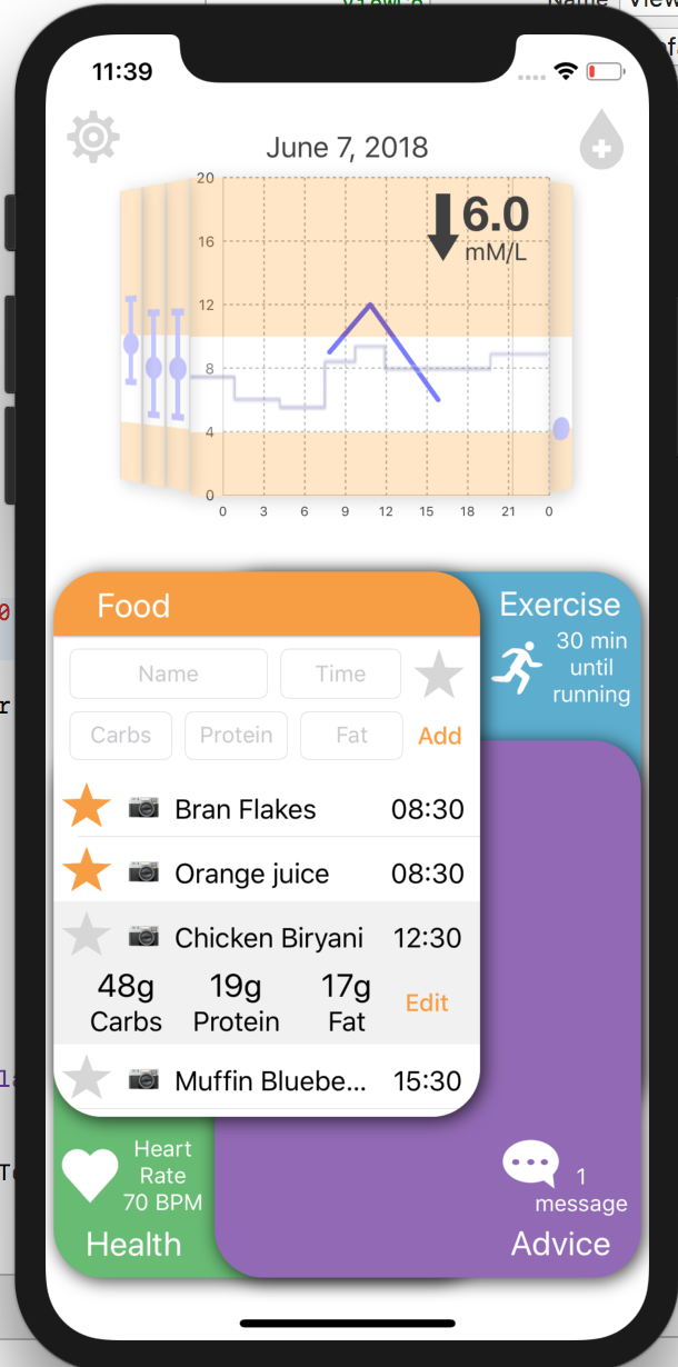
Exactly as in the client design, the app consists of 4 main sections which overlap and can be brought to the front with only one click, as well as a bifocal display to show blood glucose level. There is also a settings button in the top left which will redirect the user to the iOS settings menu for customisation.
Insulin
At the top right of the screen there is an insulin button which, if clicked, will let the user enter how many units of insulin they took and at what time.
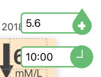
Image of Insulin entry fields when open
Settings
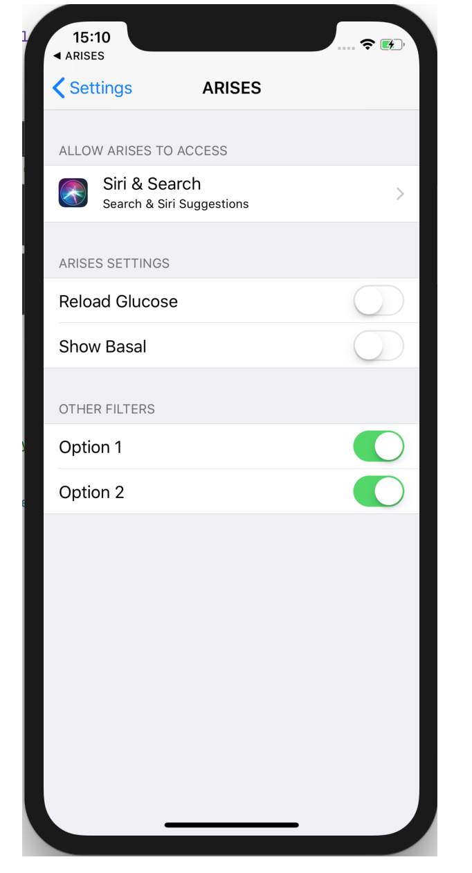
On the top left there is a settings button which, if pressed, redirects the user to the iOS settings menu. Currently all that can be customised here is whether or not temporary basal rate is present on the graph, but in the future there will be many more options in here (described in Future Work).

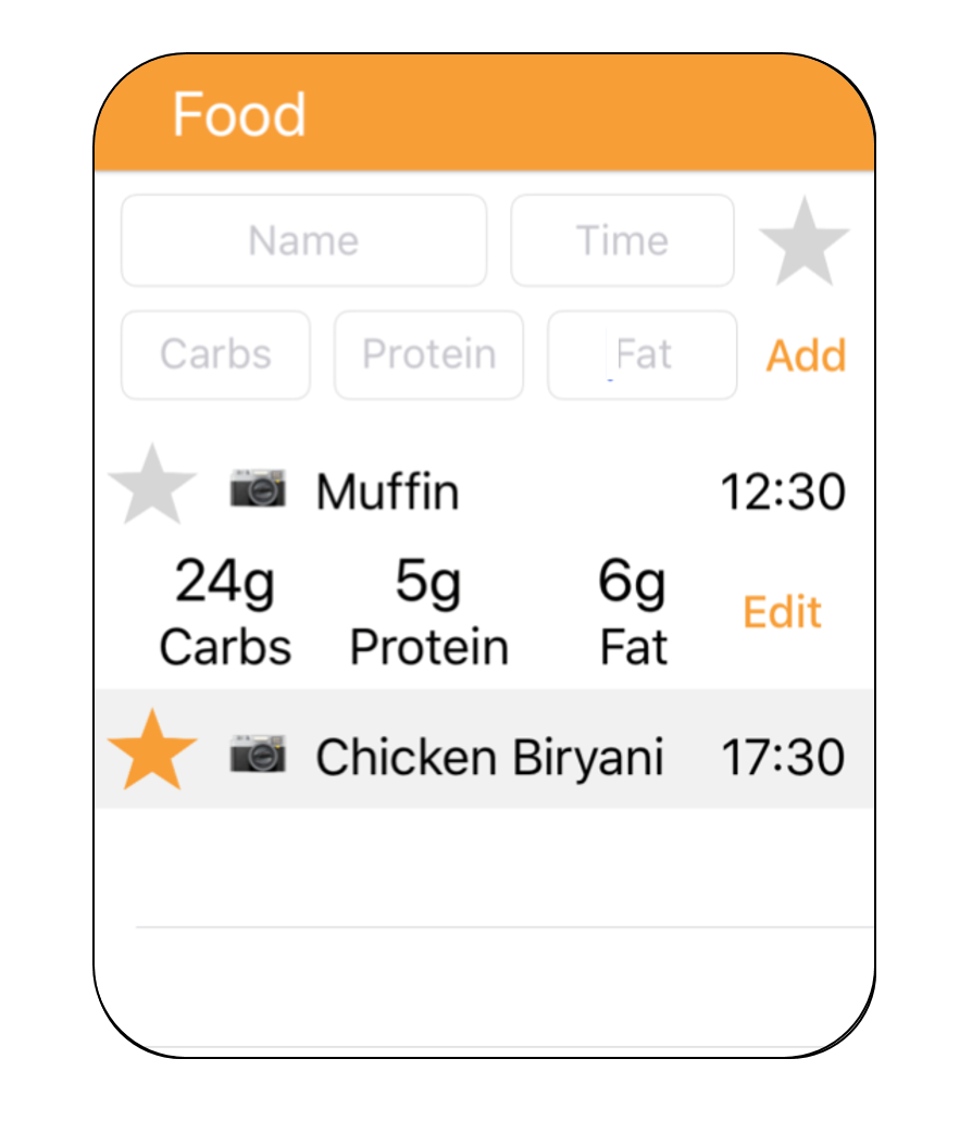
Food
- Meal Entry – The user can enter the name, time and amount of carbs, fat and protein of each meal they have in the day. The name entry is done via a normal keypad, the nutritional information entry is done via a number pad and the time entry is done via a drop-down picker view. When you click on the field and the keyboard appears, the entire food domain moves up the screen to stop the field from being obscured.
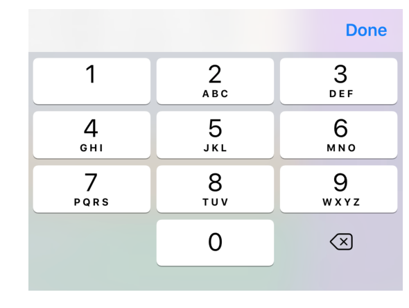
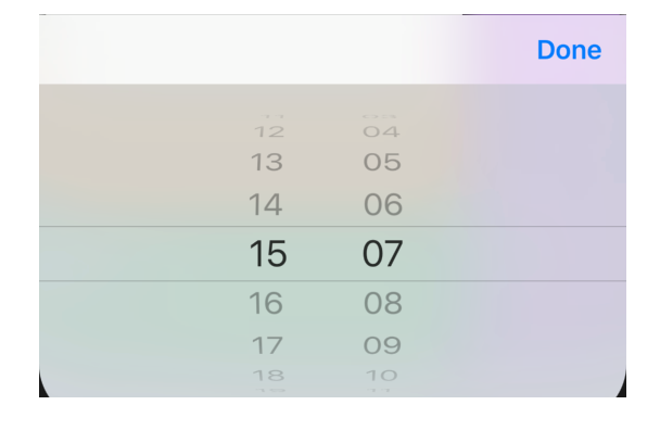
Image of number pad keyboard and time picker
- Food Daily Log – All entered meals appear in the log and clicking on any cell expands it to reveal the amount of carbs, protein and fat in the meal and an edit button which lets you change the information.
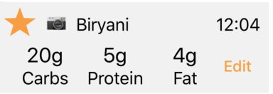
Image of food table cell
- Favouriting System – Meals can be added to favourites by highlighting the star in its cell. Clicking on the star in the top right of the domain changes the daily food table to display a list of favourited meals and clicking on any of these will auto-fill the meal entry fields so the user can change the time and nutritional information as necessary and then click add to add the meal as normal.
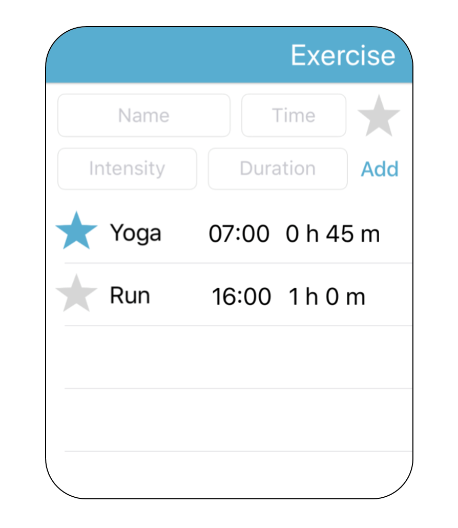
Exercise
The exercise section works identically to the food one, with the ability to enter, view and favourite exercise activities. To enter an exercise activity the user needs to enter its name (via a keyboard), time (via a drop down picker), intensity (select low, medium, high from a drop down picker) and its duration (also from a drop down picker).
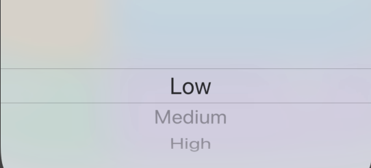
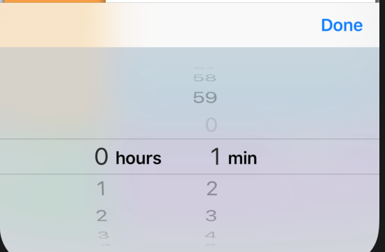
Image of time, intensity and duration pickers
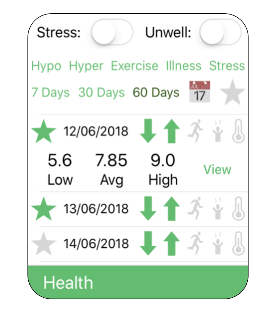
Health
- Stress and Illness Switches – The health section contains a stress and an illness switch which the user can turn on to tag and store the duration of time that they were stressed or ill on that day. This allows users to keep track of how certain factors affect their condition and could possibly be factored in by the underlying algorithm in the future.

Image of stress and illness switches
- Previous Days Log – The health section contains a table of the previous 7, 30 or 60 days at the user’s discretion. Each row contains the date and a series of 5 symbols (to represent hyper, hypo, exercise, stress and illness) which are highlighted green if a day contained that event. Clicking on a row makes it expand to also show the minimum, maximum and average blood glucose level for that day and a ‘view’ button, which if pressed, will change all the domains and the graph to display the data for that day.
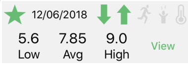
Image of health table cell
Tag Filters – you can select any of the hyper, hypo, exercise, stress and illness buttons to display only the days from within the specified period which contain these tags.
Favouriting System - Days can be favourited so you can more easily show your doctor any unusual or significant days.
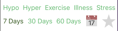
Image of health table filters and ‘show favourites’ button
Advice
It is worth noting that at this stage the advice section is largely cosmetic and a lot of the features don’t work yet. This is because of a lot of these ideas came out in the focus group at the end of the project, so there wasn’t time to implement them, and it would be difficult to do so without much data to work with.
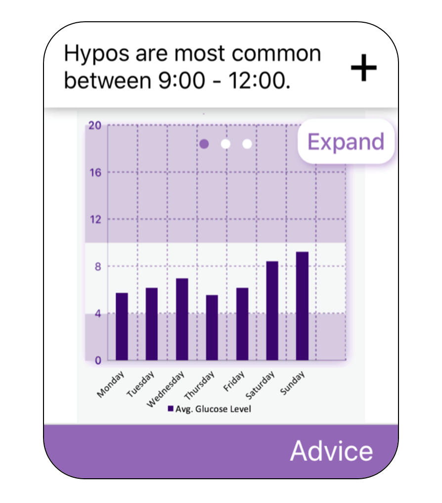
- Trend spotter – Identifies patterns, for instance ‘Hypos are most common on Wednesday morning’ which the user may be able to attribute to something in their behaviour not currently taken into account by the app and modify their behaviour accordingly. Clicking on the plus button gives you a recommended solution, for instance ‘Eat a larger breakfast’. These notifications can be dismissed if the user wants.
- Statistical Summaries – The advice section will also contain a series of plots (for instance, average blood glucose level for each day of the week) which can be swiped through or expanded into a pop-up so the user can see it in more detail.
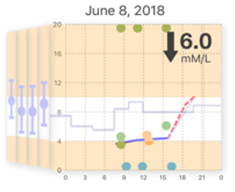
The Bifocal Graph
- The Main Face – Plots one day’s worth of blood glucose logs against time. A blue line indicates recorded levels and a dotted red line indicates predicted levels.
- Bifocal Sidebars – Each side bar represents one day in the past and the maximum, minimum and average blood glucose levels for that day are shown. If you swipe backwards in time ‘future’ side bars appear on the other side for days after the one currently on the main face. As the days are swiped through, the food and exercise sections change to show the logs from the same day as the graph.
- Current Blood Glucose Level – The current blood glucose level is shown in a large font on the graph along with an arrow showing its trajectory (e.g. gently decreasing).
- Activity Indicators – The green, orange and blue dots on the graph represent insulin, food and exercise activities respectively. Clicking on them creates a small pop-up with details about that activity.
- Date Selection - The date on top of the graph shows the date of the data currently being displayed. Clicking on this date triggers a date picker, from which any date can be selected and you will be taken to that date on both the graph and the domains below. This date picker will default to today’s date to make navigation easier.
- Chart Colouring - The chart has two peach coloured bands going from 0 to 4 mMol/L and from 10 to 20 and then a white band covering the middle region. The peach bands indicate an unhealthy blood glucose level with the higher one indicating a hyper and the lower one indicating a hypo.
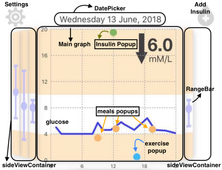
Image of Bifocal Graph
Status Indicators
The status indicators show pieces of key information on all domains that aren’t currently active and are temporarily hidden once that domain is clicked on. The contents of each status indicator is:
- Food – The total number of grams of carbs, protein and fat consumed that day.
- Exercise – The time until the next exercise activity.
- Health – The user’s current heart rate (to be taken from the sensors once fully integrated).
- Advice – The number of notifications available.
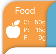
Image of food status indicator