 View on GitHub
 Design Process Reference
Design Process
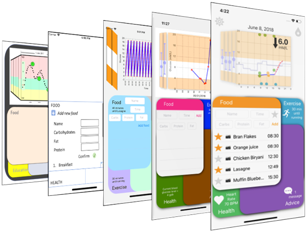
Image of design progression
Many changes were made from the original design due to technical feasibility and developer input. In addition, ideas were added based on discussions in meetings and in the focus group. The results of these decisions are shown in the interface progession graphic above. The most import design changes and the rationale behind them are detailed below for future reference.
1. Architecture
Based on the requirement of ensuring no navigational hierarchy, some additional designs to the ‘overlapping bubbles’ were proposed.
The first design (pictured below) featured four domains which started at equal sizes, but can be clicked to expand and then clicked again to reduce it to its home state. The principal motivation behind this design was limitations in technical knowledge at the start of the project and ultimately it was decided that this design was inferior to the original as it requires more clicks for the user to access information.
Initial interpretation of client design
The second design featured the more conventional approach of using tabs and is shown below. The motivations behind this design were firstly user familiarity as tabs are appear in several iOS apps and secondly it is a more efficient use of screen space, so all the domains can be larger. However ultimately, it was decided that the client’s design was better as it allows more space for the status indicators described in the previous section and the decrease in usable space by each domain was acceptable given the amount of content involved.
Interface prototype of tabs design
2. Usage of non-active space
There was then a question of what to do with the content on the domains when not in use, as if the user could see parts of information poking out behind the currently open domain it would be visually confusing and unappealing. Similarly, if the information moved around to always be fully in or out of view it would be no less confusing or off-putting. Consequently, it was decided that domains not currently at the fore should have a solid fill colour and display no information other than the status indicator.
Another area of discussion was what to do with these status indicators when their domain was in front, as it would take a lot of useful space out of the app if they were still visible, and make the active content difficult to position. It was eventually decided that the status indicators should be hidden when that domain is in use.
3. Bifocal Display
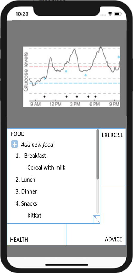
The client’s initial design for the bifocal had the side bars containing the full previous day’s graph but tilted so that it appeared to be going into the distance. The problem with this is that it looked incredibly cluttered and since blood glucose level goes up and down several times during a day, it was difficult to get any useful contextual information from this. Consequently, it was decided early in the process that the sidebars should show summary data (i.e. max, min and average).
There was also discussion about whether continuous scrolling (i.e. you can see partial days) or discrete scrolling (only one entire day at a time on the main face) should be used. It would be useful for diabetics to see what would happen to their blood glucose overnight (technically the next day), but similarly it would be easy to get lost while scrolling. Ultimately it was decided that it is not too inconvenient to swipe a day into the future to see night-time predictions, whereas continuous scrolling could lead to confusion.
4. Settings Button
The decision to include a settings button was the result of the focus group meeting where the attendees expressed a desire to customise the amount of technical information about dosage calculation and the tags which can be applied to a day. Currently this takes the user to the app settings within the phone, but ultimately it may be better for that button to produce a pop-up in which settings can be altered.
5. Insulin Entry
The client’s original ideas for insulin entry were for either the app to assume the user has taken the calculated amount, or for the user to be able to input how much insulin they take as they enter meals (given that most doses are taken with meals). At the focus group meeting it was clear that neither of these designs would be adequate since many diabetics take insulin a short time before their meals (pre-bolas) or outside of meal times, and others would not always trust the dosage recommendations so may take more or less.
The final design allowing the user to input insulin independently of anything else, at the top of screen, circumvents the problems mentioned above and is justifiable due to its importance. While Insulin does not have a table associated with it, doses are represented by green dots on the graph and can be clicked on to reveal their units.
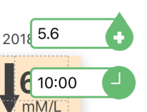
Image of Insulin entry fields when open
6. Data Entry Methods
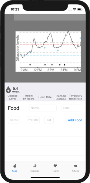
There were also questions about the most user-friendly way to input meal and exercise information, especially with regards to the carbs, fat and protein information. There was discussion about whether to use a sliding scale (the client’s initial proposal and pictured below) or a number pad. Eventually a number pad was chosen because a slider would need a maximum value and it would be difficult to get a high enough resolution with a large range of values, causing users to struggle to input the correct number.
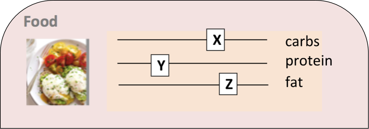
Image of Sliding Scale design
Drop down picker menus were used for selecting times and the exercise domain’s intensity and duration fields, since these have a reasonably small and discrete set of values they can take.
7. Favouriting System
Since most people have a set of meals they eat regularly, it was decided that the app needed to be able to store meals and let the user add them from memory.
The first idea was to have the app store every meal ever entered, however this would become very confusing, since for instance, a pizza from every pizza place you’ve ever visited would be stored, whereas it would be much more useful to just store the one you visit most often. Consequently, it was decided that users should be able to decide which meals should be stored as favourites, using the star system described in the final design section.
Originally, to add a meal from favourites it would simply need to be clicked on in the favourites list, however you would then need to edit it to change the time and adjust for portion size, so instead the current system of auto-filling the text fields was implemented.
8. Food Carousel
Another proposition for selecting meals from favourites involved taking pictures of favourite meals. The ‘choose from favourites’ button would then cause a wheel of these images to appear and slowly fan out until the user selected the desired meal. Problems with this include that it would be difficult to discern between similar looking meals and would take a lot of time to use. Time constraints and technical difficulty were the main reasons this feature wasn’t implemented.
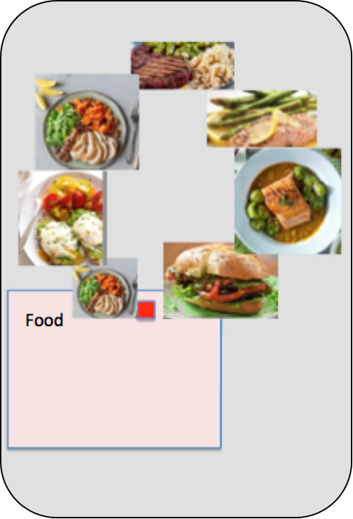
Food Carousel
9. The Purpose of the Advice Domain
As mentioned in Client Design, the original purpose of the advice/education section was to send the user links to interesting new research and advice, however the focus group attendees unanimously agreed this would not be a useful feature. Alternative uses for this domain were discussed, and it was ultimately decided that being alerted of trends the user might have missed and could attribute to regular activities in their life would be helpful. The inclusion of a dismiss button was something they thought was important, in case they found the advice unhelpful.
The decision to include supporting trends charts was made to provide data to support the claims and allow the user to identify trends themselves.
10. Tags
The use of stress and illness tags were featured in the client design, however the focus group said they would find different things like menstruation and travel far more useful, so it was decided that these should be customisable and users should be able to create their own tags. While there hasn’t been time to implement this since the focus group, it would ultimately be done either via the settings menu or directly in the health domain.
11. Status indicators
Status indicators were a key part of the initial design and one of the key advantages of the chosen architecture. When discussing what these indicators should contain, several ideas were generated, so it was decided that each section should have multiple status indicators which the user could swipe through to get as much information as possible. This feature has not yet been implemented.
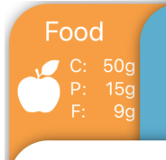
Image of food status indicator
12. Current blood glucose
In the original design current blood glucose is displayed in one of the status indicators, which is reasonably small and not visible if that section has been selected. Given the importance of always having access to this figure, it was decided that it should be put in large letters at the top of the bifocal display. The trajectory arrow was suggested by the focus group and will be implemented in the next stage of project development.