 View on GitHub
 Graph Reference
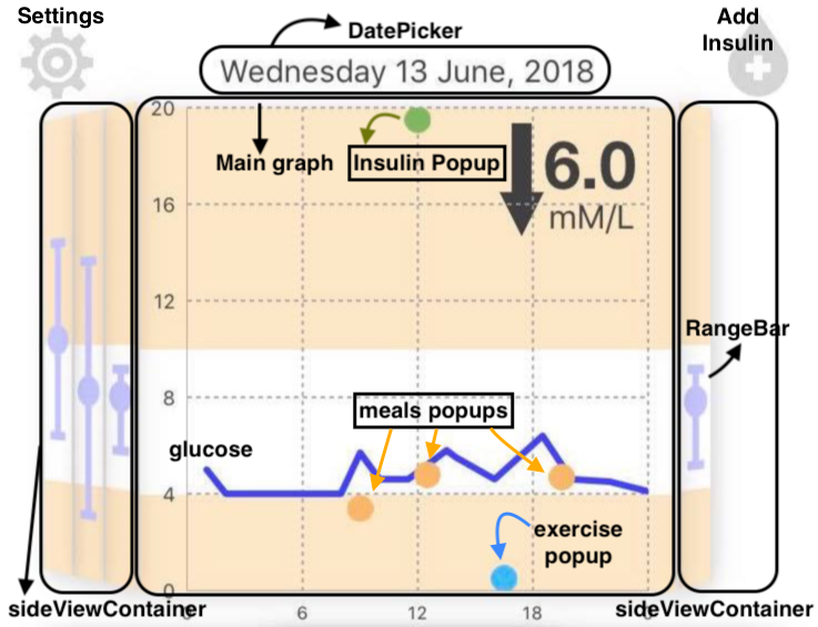
Graph
Features
- The most important information is displayed on the main graph while less relevant, contextual data is displayed on the side views.
- Swiping left and right lets users change which days data is being shown on the main face.
- The date above the graph bifocal corresponds to the date of the data being shown on the main face. Tapping on this date triggers a picker which lets the user jump to any day. The default date on the picker is set to today’s date for ease of navigation.
- Shows monitored blood glucose level in mMol/L during a 24-hour period (to be taken from patients’ wearable).
- To keep the graph area as clean as possible the time interval displayed on the x axis is set to 6 hours.
- Meals, exercises and insulin are represented on the main graph using orange, blue and green dots respectively and are appear as soon as they are logged.
- Pop-ups containing detailed information are triggered when the dots are tapped.
- For meals this contains name, carbs, protein and fat
- For exercise it contains name duration and intensity
- For insulin it contains number of units and time administered.
- The side views show the users’ minimum, maximum and mean blood glucose levels on that particular day.
ChartBase Setup
The bifocal display consists of three parts:
- Leftside view container
- Main graph section
- Rightside view container
Left & Right Side View Containers
Each of the side view containers has three subviews of type CustomView (UIView) which are set up to show colours bands as a background.
ChartBGView and CustomView
The same colour bands are also used on the main chart, so the same logic is used for both*ChartBGView.swift* and CustomView.swift. Additionally, CustomView.swift is used to draw the range bars on each side view, using values calculated from the glucose readings, which are stored in core data where they relate to a certain day.
CustomView.colourMiddleBand()
Description: This function draws a white rectangle starting from the midpoint of the view and extending down to cover 20% of it.
Returns: Given the view background colour is set to peach, this yields the image pictured below
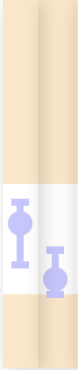
CustomView.drawRangeBar()
Description: This function draws the maximun and minimum dashes as well as the average circle on side views. It does this using the function UIBezierPath (documented [here]), which allows line width and stroke colour to be set. The stroke length is set based on the difference between the maximum and minimum glucose values for the day
Returns: A UIView with the range bar drawn on it as pictured below

Main graph section
ViewControllerGraph
This view controller handles everything directly related to the graph. These features are:
- Transform side view containers into skewed bi-focal ones
- Load temporary arrays into Core Data
- Create the date picker when the current date is clicked on
- Update graph based on settings
- Trigger pop-ups based as activities dots are selected
To do this, modifications are made on top of an iOS chart library which can be found here The layers used are described below.
xAxisLayer contains model and label settings for the time axis (x-axis). It spans 24 hours from, starting and ending at midnight, with time intervals of 6 hours.
yAxisLayer contains model and label settings for the glucose axis (y-axis). The axis range is set to go from 0 to 20 (mM/L) with an interval of 4.
yHighAxes contains an invisible carbs axis on the right side of chart against which meal dots are plotted to make them higher up if they contain more carbs.
guidelinesLayer provides dotted grid lines on graph.
pointslineLayer draws glucose curve on graph in a solid blue line
prediction shows the red dotted prediction line for the next half hour of the patient’s glucose levels
chartPointsCircleLayer is where the pop-ups are set. It uses a touchHandler to determine which dot has been tapped so the correct message can be displayed. The touchHandler detects where the finger taps on the screen and compares the x-position of the touch with the x coordinates of stored pop-ups. If they match within a degree of tolerance the infoBubble is enabled which displays a message to user.
-
The UIViewController subclass for the top half of the app’s UI. It controls the bifocal display utilising the SwiftCharts library, referenced in the documentation.
See moreDeclaration
Swift
class ViewControllerGraph : UIViewController -
Extension to the ChartPointEllipseView class from the SwiftCharts library allowing a string to be associated with an individual point on the chart, which gives the method for determining what text should be displayed on the point’s popup.
See more
-
The class is a subclass of UIView and is used in the bifocal display as the sideViews. It includes methods to draw the daily glucose ranges calculated using the member data and to draw the upper band for the background ‘safe’ range.
See moreDeclaration
Swift
class CustomView : UIView
-
This class is a subclass of UIView used to create the three bands of the ‘safe’ range for the background of the chart using it’s methods.
See moreDeclaration
Swift
class ChartBGView : UIView